I’ve been reaching for this effect for years. I first noticed it on an older version of the SoundCloud native app; the web app never implemented the animation. Never noticed it much elsewhere on the web either but I’ve always been a fan. The effect regards a “card” element containing an image. The image moves within its’ own containing element relative to its position in the viewport. The movement would be vertical if the scroll direction is up/down and horizontal if left/right. Like most animation on the web this previously required scripting but modern CSS makes it possible with styles and markup alone.
The animation
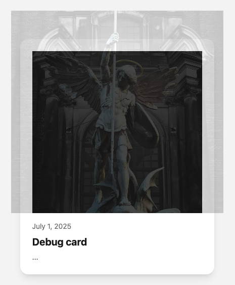
Using a traditional vertical scroll orientation, the top edge of the image is positioned along the top edge of its containing element when the card enters the viewport from the bottom of the window. The image needs to be larger than its container to allow for image position updates.
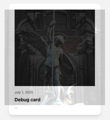
As the page scrolls the image position continuously updates towards an alignment with the top of the image container. When the card element is exiting the top of the viewport the top edge of the image is then aligned with the top of the image container.
Browser support is currently limited, here is a video of the effect in action:
The markup
Nothing too notable here – a traditional card setup. Main thing that matters is the wrapper element which will contain the image.
<article class="card">
    <figure class="img-wrap">
        <img />
    </figure>

    <!-- card heading / other details -->
</article>
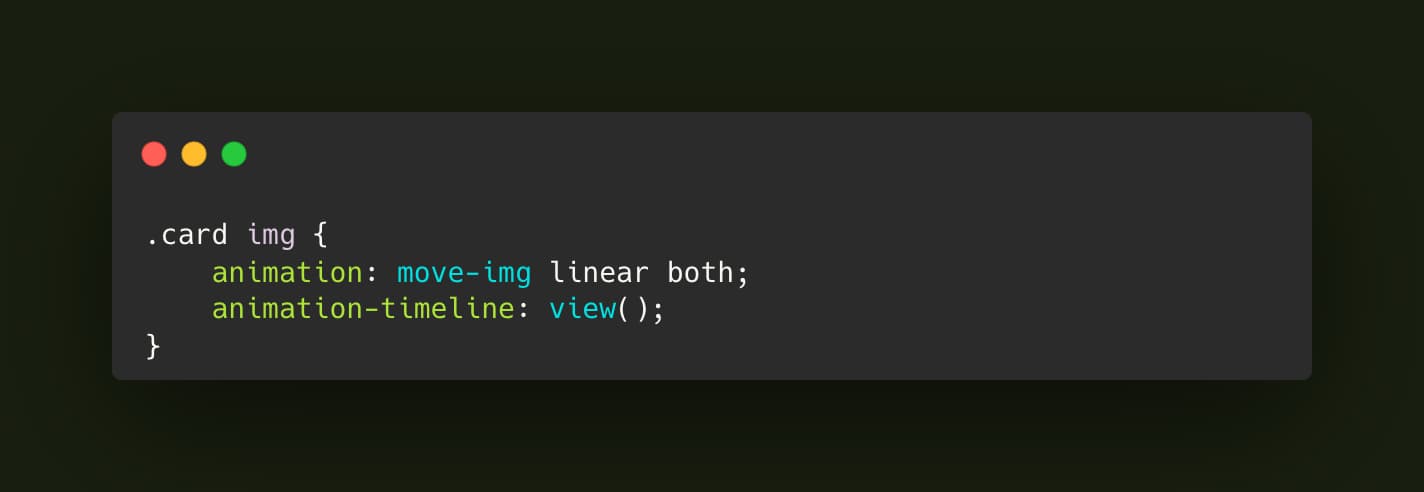
The Styles
Naturally this is where the magic happens. As noted the image must be larger than the containing element, we do that with scale(1.25). Given that transform the math for the placement works out to be (image height * 0.1) * -1 for the negative Y offset at the start of the animation when the card enters from the bottom of viewport. Then the same equation without the * -1 for the end keyframe where the card is exiting at top of the window.
Normally hiding the image overflow would be achieved with overflow: hidden on the parent; however, in this case doing so would prevent the image element from connecting to the page scroll via animation-timeline: view();. To get around that we employ clip-path.
“Both” is used for the animation-fill-mode , this ensures that styles in the starting block of the animation keyframes are applied immediately. Conversely the end keyframe styles persist when the animation reaches the end.
Finally in all animation it’s important to respect user preferences so don’t forget @media (prefers-reduced-motion: no-preference).
:root {
    --img-height: 320px;
}

@keyframes move-img {
    0% {
        transform: scale(1.25) translateY(calc((var(--img-height) * 0.1) * -1));
    }
    100% {
        transform: scale(1.25) translateY(calc(var(--img-height) * 0.1));
    }
}

.img-wrap {
    height: var(--img-height);
    clip-path: inset(0 round 12px);
}

@media (prefers-reduced-motion: no-preference) {
    .card img {
        animation: move-img linear both;
        animation-timeline: view();
    }
}
The effect works best on touch screens.