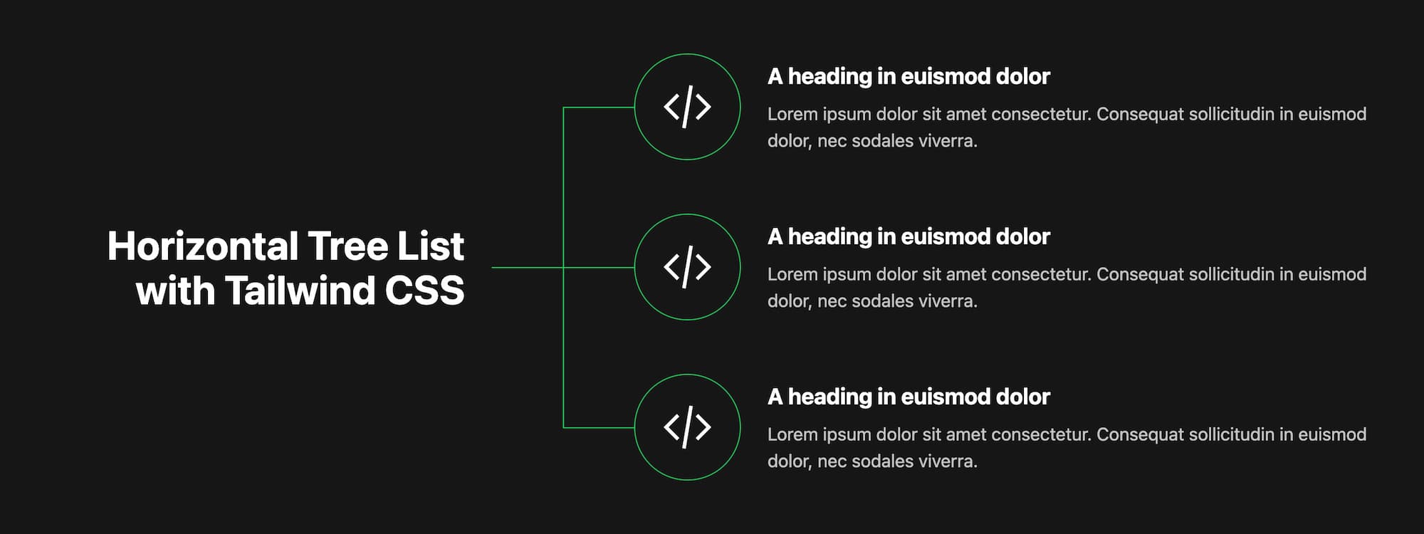
I recently had the need to build a “tree list” styled with icons per list item. Visually the concept was similar to a family tree chart except horizontal and two levels deep: Heading + 1 level of Items. Considering implementation, the connect.tailwindcss.com site immediately came to mind. I had seen a similar concept there in their schedule timeline. The code I ended up using was based on that implementation:
The solution is one purely of HTML and CSS. The markup for each list item is the same yet the presentation will differ based on whether it is first in the list or not. If you inspect the timeline example you’ll notice the element which draws the vertical line has a top offset in the first list item. This is achieved with the Tailwind’s group utilities:
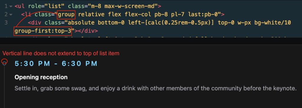
The CSS selector in the example above ends up being:
.group:first-child .group-first\:top-3This selector applies styles conditionally if the element is a child of the first item in the list.
So taking that same concept I put together the following list. Each list item is given a .group class. A child div is responsible for drawing a vertical line along the inline-start side of the list item block.
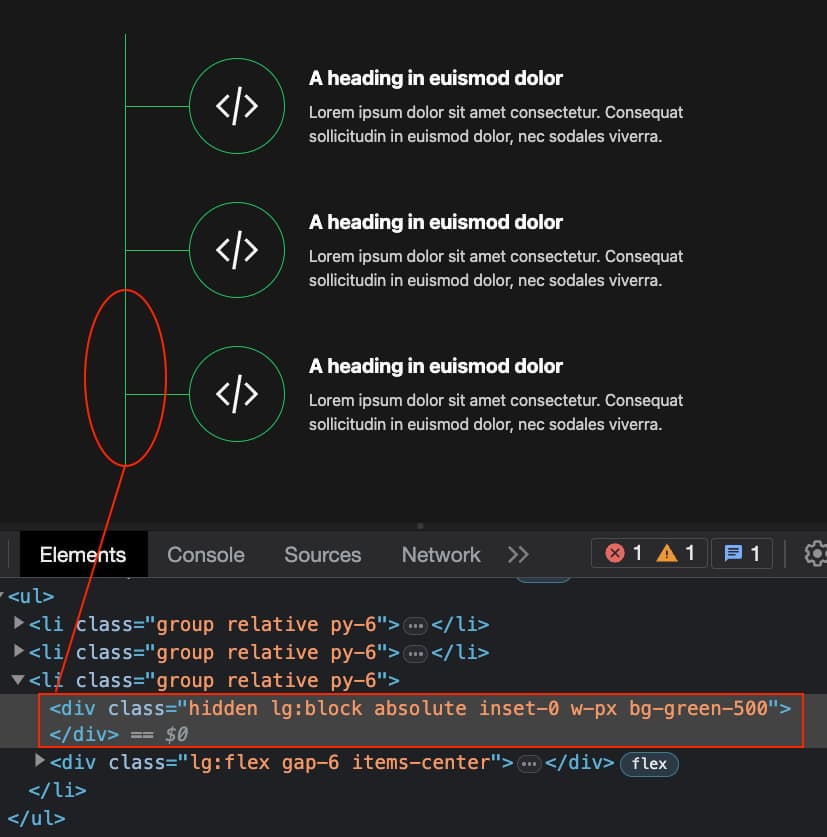
To the element rendering the vertical line classes group-last:bottom-1/2 group-first:top-1/2 are added. The effect is most of the way there at this point.
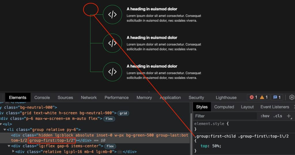
With the group-last: utility we can similarly target an element if it is a child of the last item in a .group.
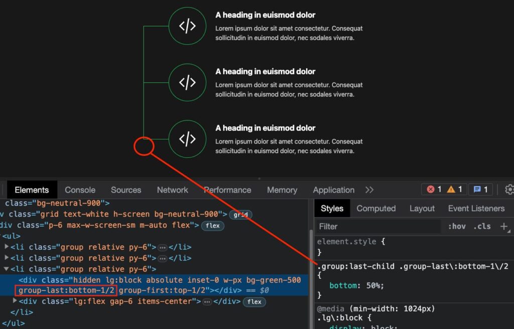
The effect remains in tact no matter how many items are in the list.
Finally, the list is wrapped along side an additional column which includes the heading to complete the layout. See it in codepen.
